DESIGN-CENTRIC SOLUTION

BRAND VISION
The vision of the Type Stylin’ Project is to radically change the face of design regarding diversity, equity, and inclusivity. Utilizing a culturally appropriate curriculum, educators will connect students of color to educational opportunities in Visual Communication through street art and graffiti.
Brand Personality
Defining a set of human characteristics for the Type Stylin’ Project brand ensures the program resonates with students of color and educators alike. This researcher described TSP’s brand personality as authentic, bold, diverse, creative, and educational. By eliciting a positive emotional response from Black and Brown high school students, TSP increases its chances of short- and long-term success.
LOGO DEVELOPMENT
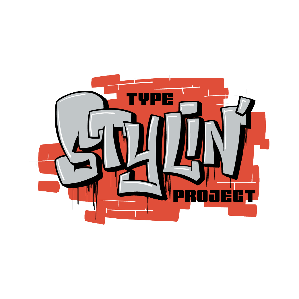
The look and feel of Type Stylin’ Project required an extensive branding effort starting with the logo design. With authenticity in mind and taking inspiration from various graffiti art styles including tags, stickering, throw-ups, blockbusters, and pieces, this researcher explored over 60 creative directions for the initial logo concept. Logo ideation began as rough pencil sketches that were refined through an iterative process resulting in three brand marks that were considered for implementation. The final logo—created in a graffiti blockbuster style—was ultimately chosen for its readability, significant mass, and bold aesthetic.
Logo options developed as part of the design-centric solution.
VISUAL DEVELOPMENT
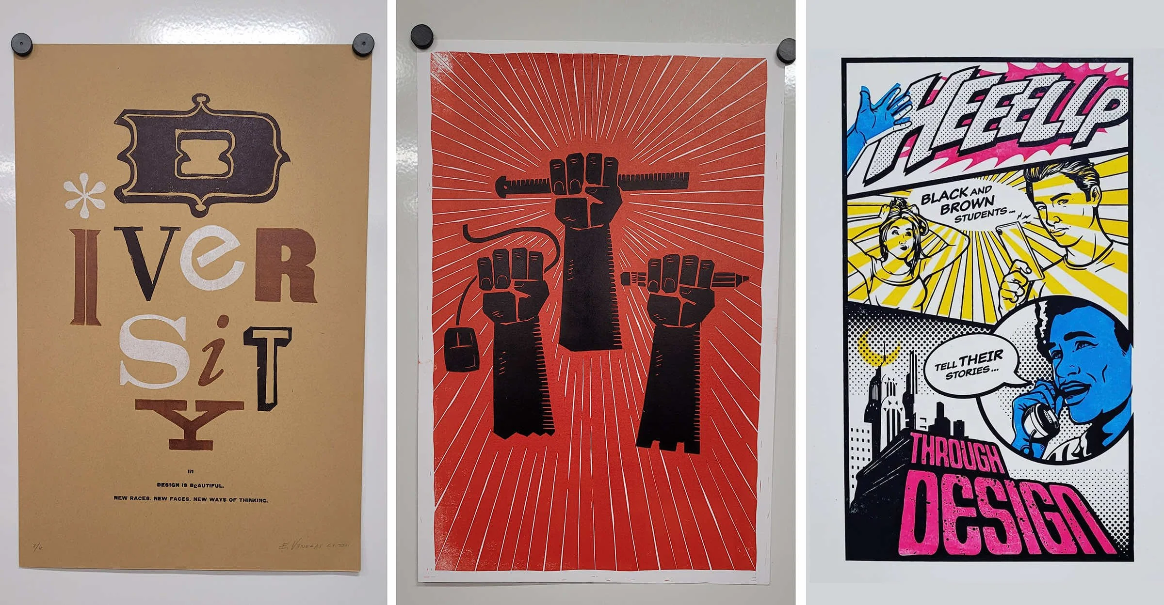
Before concluding a thorough review of the literature, this researcher expressed the initial visual explorations for the design-centric solution as rough pencil sketches, refined into digital comps, and finally letterpress prints. The letterpress explorations were divided into type, image only, and layouts that combined type and images. While created without the benefit of research, the initial visual development delved into more militant messaging and imagery inspired by the 1960s Civil Right Era in the United States. Additionally, as the research became more focused since the thesis proposal was approved, the visual development moved away from aesthetics inspired by comic books and graphic novels.
Initial visual development as rough pencil sketches.
Refined visual development concept as digital comps.
Visual development concept executed as letterpress prints.

MOOD BOARDS
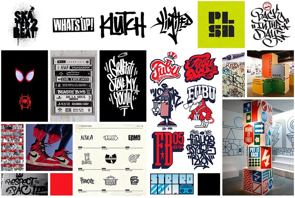
Research completed for the thesis topic informed the aesthetics of the design-centric solution. To organize and identify visual themes and relevant concepts for executing the Type Stylin’ Project, this researcher formulated numerous mood boards exploring color, graffiti art styles, hip-hop branding, urban fashion trends, logo options, and exhibition design. To ensure that the vision for the design-centric solution was being conveyed consistently regarding the research, the researcher referenced the mood boards at each stage of the thesis exhibition development process.
A sample mood board exploring color, graffiti art styles, hip-hop branding, urban fashion trends, logo options, and exhibition design.
TYPOGRAPHY
The execution of a successful design-centric solution relies heavily on typographic selections. Design luminary Lazó Maholy-Nagy believed that “The typographical materials themselves contain strongly optical tangibilities by means of which they can render the contents of the communication in a directly visible—not only in the indirectly intellectual—fashion (Maholy-Nagy 34).” In other words, the shape and construction of letterforms can subtly communicate emotional qualities, historical significance, or cultural affiliation beyond the meaning of the content they represent.
In researching the design-centric solution, this researcher identified three typefaces that tied in with the overarching concept for the Type Stylin’ Project—the Neue Black, VTC Spike, and Gotham.
An example of the Gotham typeface by Heofler&Co. Hoefler&Co., www.typography.com/fonts/gotham/design-notes.
Introduced in 2000 by Heofler&Co, Gotham is a no-nonsense sans serif typeface that celebrates the attractive and unassuming lettering of New York City—the birthplace of modern graffiti in the 1970s. The Gotham Family includes a wide range of weights and widths, making it ideal for subheads, body copy, and small-scale applications.
An example of the Neue Black typeface by Tré Seals of Vocal Type. Vocal Type Co.,
www.vocaltype.co/history-of/the-neue-black.
The Neue Black is a variable-width, sans serif typeface based on the signage of Martin Luther King Jr’s and the Southern Christian Leadership Conference (SCLC) Chicago Freedom Movement. The campaign marked the expansion of their civil rights activities from the South to northern cities. It was created by Tré Seals—a BIPOC designer, typographer, and founder of Vocal Type.
An example of the VTC Spike typeface by Tré Seals of Vocal Type. Vocal Type Co., www.vocaltype.co/history-of/spike.
Inspired by iconic “LOVE” and “HATE” rings from the Spike Lee film Do The Right Thing, VTC Spike is another creation by Tré Seals of Vocal Type. VTC Spike is a heroic display face that contains three styles. The type family is based on the primary headline typeface from the book SPIKE by Spike Lee, which Tré Seals also designed in 2021.

COLOR SCHEME
When choosing colors for a design, appropriate selections possess the ability to subtly communicate emotions, concepts, and gain acceptance from a target audience. Although often thought to be subjective, research indicates blue is the most popular color—followed by red— regardless of race or gender. However, data gathered from a study by Silver et al. indicates that African American students show a “preference for red, purple, black, and less frequent colors (Silver et al. 295).” In addition, research into the cross-national meaning of colors and color preferences by Madden et al. concluded that study respondents in the US associated black with masculinity and red with activity or emotion. Furthermore, study respondents from the United States most often paired black and red colors (Madden et al. 98–99). This researcher has based the following color palette for the design-centric solution on Silver et al. and Madden et al.’s research.
Black
Pantone Black C
CMYK: 0-0-0-100
RGB: 0-0-0
HEX: 000000
White
Pantone N/A
CMYK: 0-0-0-0
RGB: 255-255-255
HEX: FFFFFF
Red
Pantone 7417 C
CMYK: 1-83-85-0
RGB: 224-78-57
HEX: E04E39
Gray
Pantone 428 C
CMYK: 10-4-4-14
RGB: 193-198-200
HEX: C1C6C8
The color palette for the design-centric solution.
DESIGN-CENTRIC SOLUTION
Based on academic investigation, this researcher has developed a curriculum—dubbed the Type Stylin’s Project or TSP—to increase the number of Black and Latinx students in visual communication. TSP utilizes a mixture of place-based education, social responsibility, and hip-hop culture, which allows BIPOC students to tell their counterstories through graffiti and street art as a gateway to studying graphic design.
Development of the Type Stylin’s Project includes:
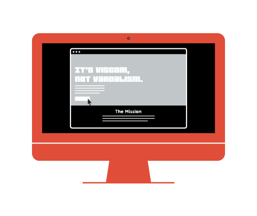
A responsive online platform
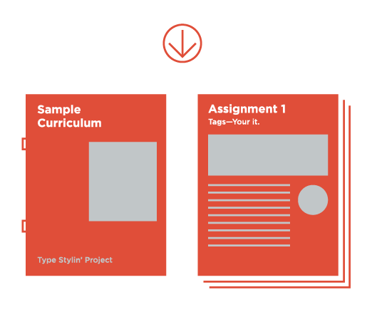
Downloadable curricula complete with workbook, student learning outcomes, assignments, examples, rubrics, and exercise sheets for individual and group activities
Opportunities for community public art projects
Summer workshop and after-school program content


